
The data set is us_time_survey. This data set is available on openintro.org/data and is available in the `usdata` R package.
This week's data set of the week is us_time_survey. I like this data set because it relates to all things that young (and old) adults experience: sleeping, eating, working, and spending time in leisure. The US Department of Labor collects survey data on this each year. Only individuals 15 and over participated in the survey. The data set includes the years 2009 to 2019 and consists of the average time spent on seven different variables.
This data set is an excellent way to introduce how averages from groups will show less variability in the scatterplots than individual results. Additionally, I find sleep is a great conversation starter for students. It is usually a topic that most people feel open to discussing, so it can be an interesting ice-breaking topic for the class.
One way to introduce this topic is to ask students the following questions.
- How did everyone sleep last night?
- Do you think you are getting more sleep or less sleep than you did last year? How has it changed over the past decade?
- Over the past decade, how do you think that would be for people living in the US?
(When I asked my students, most students felt that Americans' sleep decreased over the past decade.)
Then, you can spend some time creating the scatterplot and talking about what it represents.
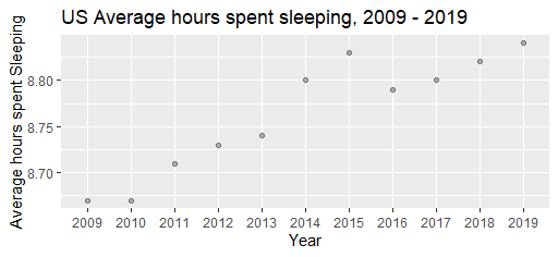
After discussing the plot's direction for the past decade, a good exercise would consider this next series of questions.
- What does each observation in the scatterplot represent?
- Sketch how a plot might look if it showed the results of each person surveyed rather than the average for each year.
- Describe how this sketch that you made is different from the one made from averages.
-
Consider the correlation values for the following.
- averages of groups vs. year
- raw data of the groups vs. year
Source: Department of Labor, https://www.bls.gov/tus/