
You may find this data set in the `usdata` R package (automatically loaded with the `openintro` R package) or on this page.
This week’s dataset is airline_delay. This data set is data that is collected by the Bureau of Transportation Statistics. This data set includes count data for each airline for each carrier per US city. There are twenty-one variables, including the number of flights delayed for more than 15 minutes, the number of flights canceled due to a security breach, and many others. This data set contains only data from December 2019 and December 2020. Thus, allowing students to concentrate on a prevalent time of year to travel in the United States, visiting family for the holidays, taking advantage of school break, or even celebrating the new year. I was interested in this data set because I investigated how the airline delays during December were affected by COVID-19. I had expected that the delays would be longer, but the data surprised me.
The data set provides an excellent opportunity to discuss multivariable relationships. One of the emphases of GAISE 2016. One interesting visualization that you might have students do is compare the number of arrivals to the number of flights delayed for more than 15 minutes. They can then compare this relationship between December 2019, before COVID-19 had affected much of the United States, to December 2020, when COVID-19 was having a significant impact on the lives of those in the United States but before vaccines were broadly available.
Before beginning the data analysis, it is helpful to explore students’ predictions about what the data might look like and to invoke their interest in the topic.
A few possible questions are listed below.
- Asking students how often they have flown before COVID and then during COVID?
- Have they ever had a delayed flight?
- Do they think that there were more flight delays before or during COVID?
One possible visualization to explore is the relationship between the number of arrivals and the number of delayed flights.
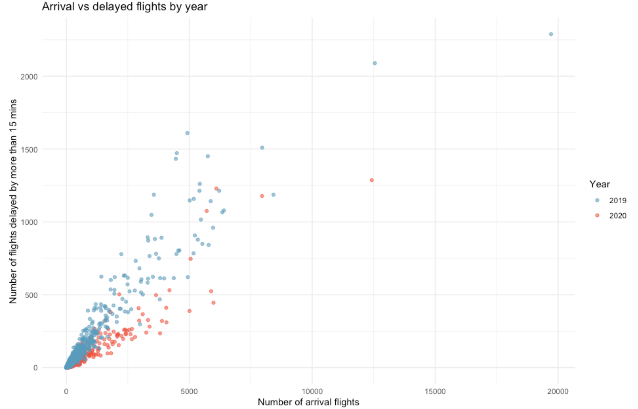
Interesting questions to ask students about the data set.
What does each dot represent?
Overall, describe the relationship between the number of arrival flights and flights delayed?
For the same number of arrival flights, which year had more delays?
Overall, were there more delays in December of 2020 or December 2019? Was this what you expected?
What other questions do you have about this relationship?
I hope that you enjoy exploring the airline delay data set.
Source: Bureau of Transportation, Airline Service Quality Performance 234 bts.gov